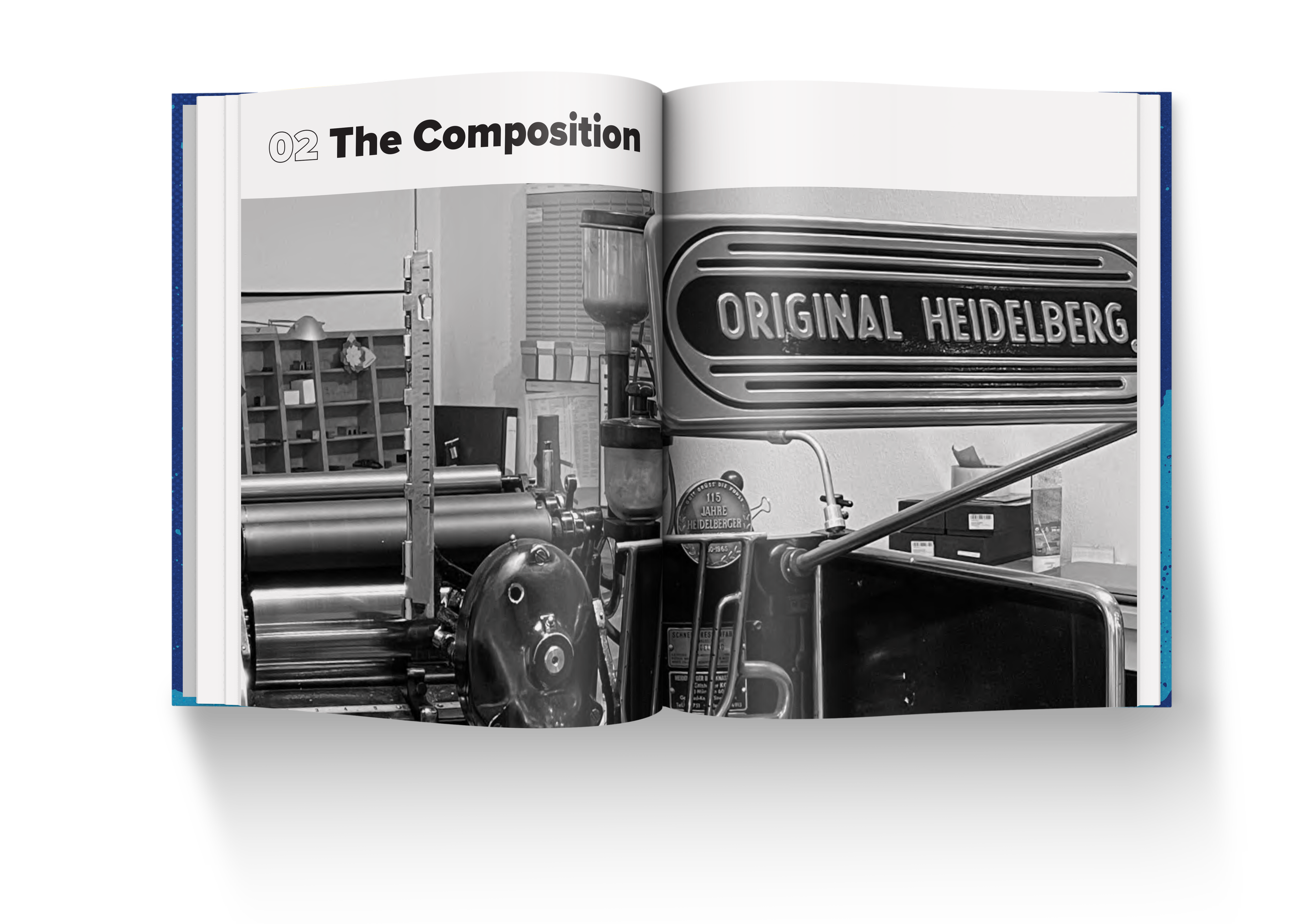
Clarity In Type
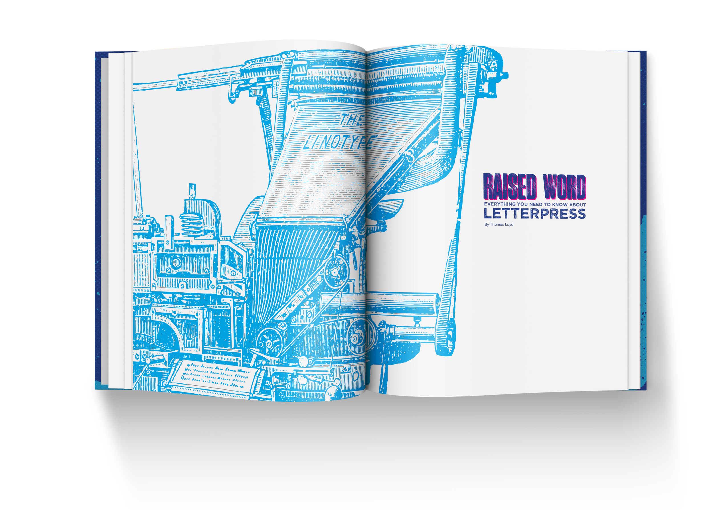
Raised Word Letterpress
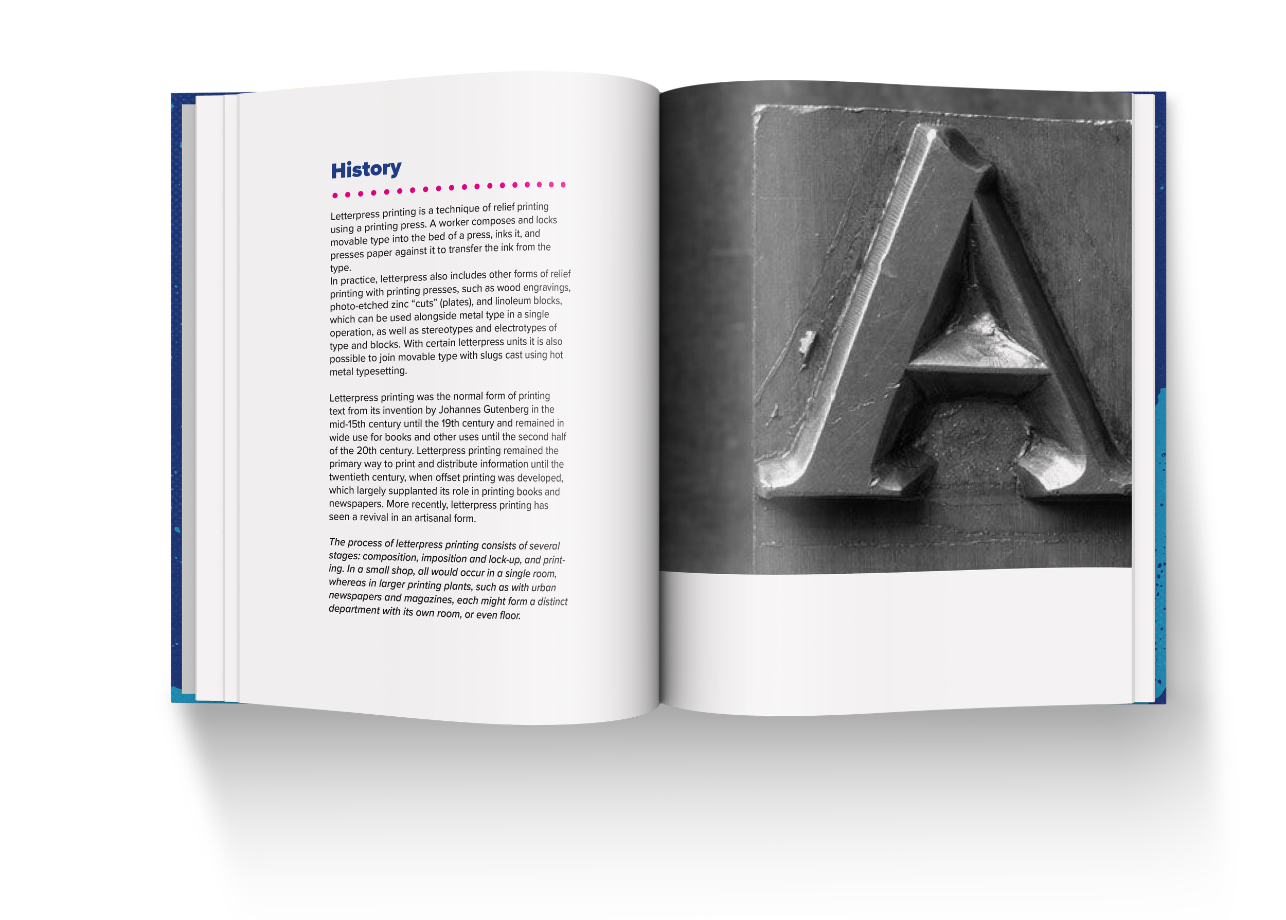
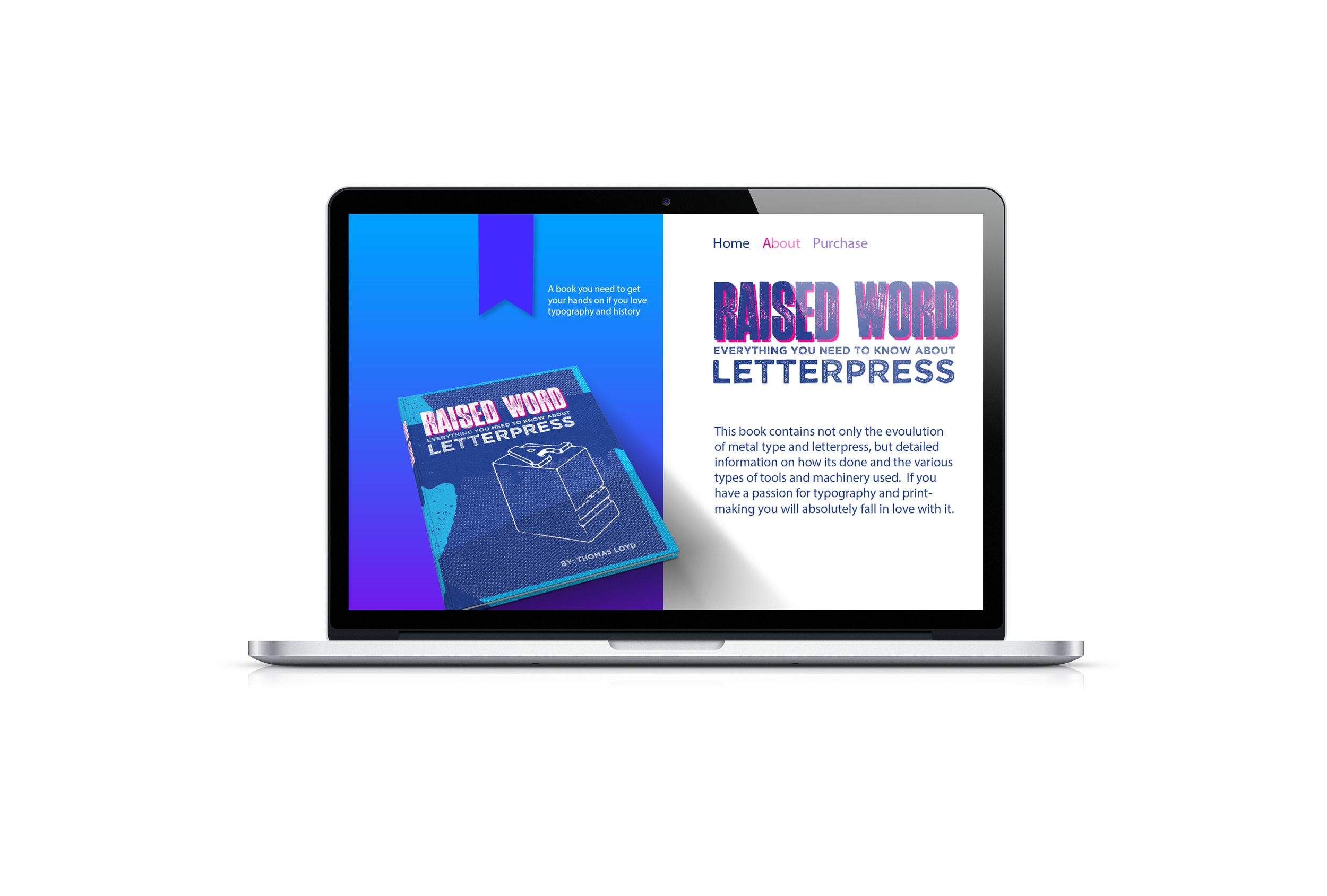
OBJECTIVE
To create an educational yet visually rich book that both honors the historical craft of letterpress and serves as a modern, accessible guide for enthusiasts, designers, and printmakers. The objective is to demystify the letterpress process through clear instruction, visual storytelling, and an aesthetic that reflects the tactile beauty of the medium itself.
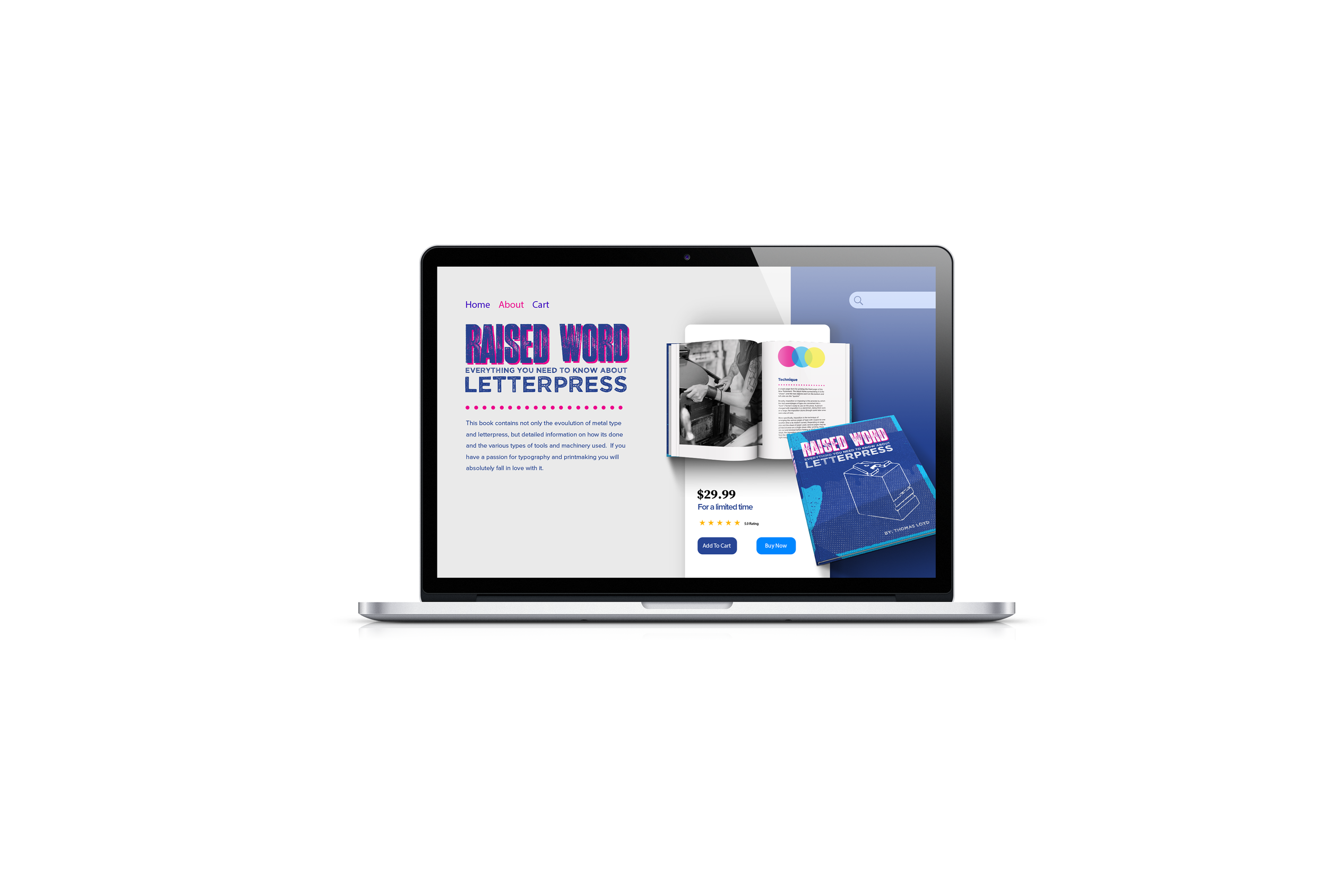
DESIGN
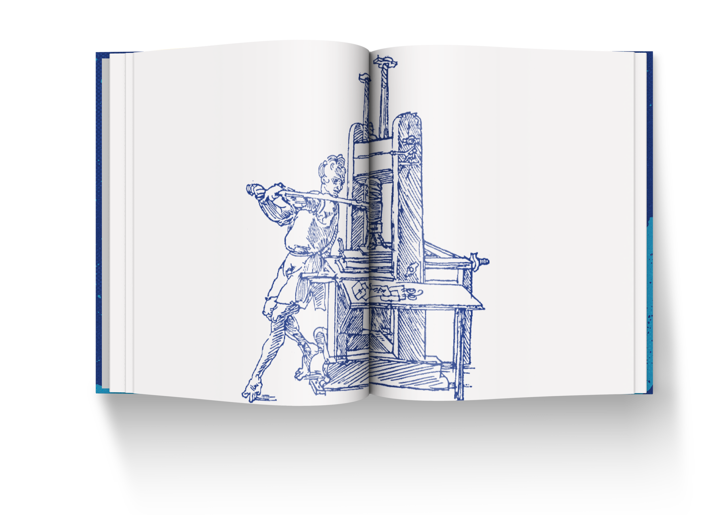
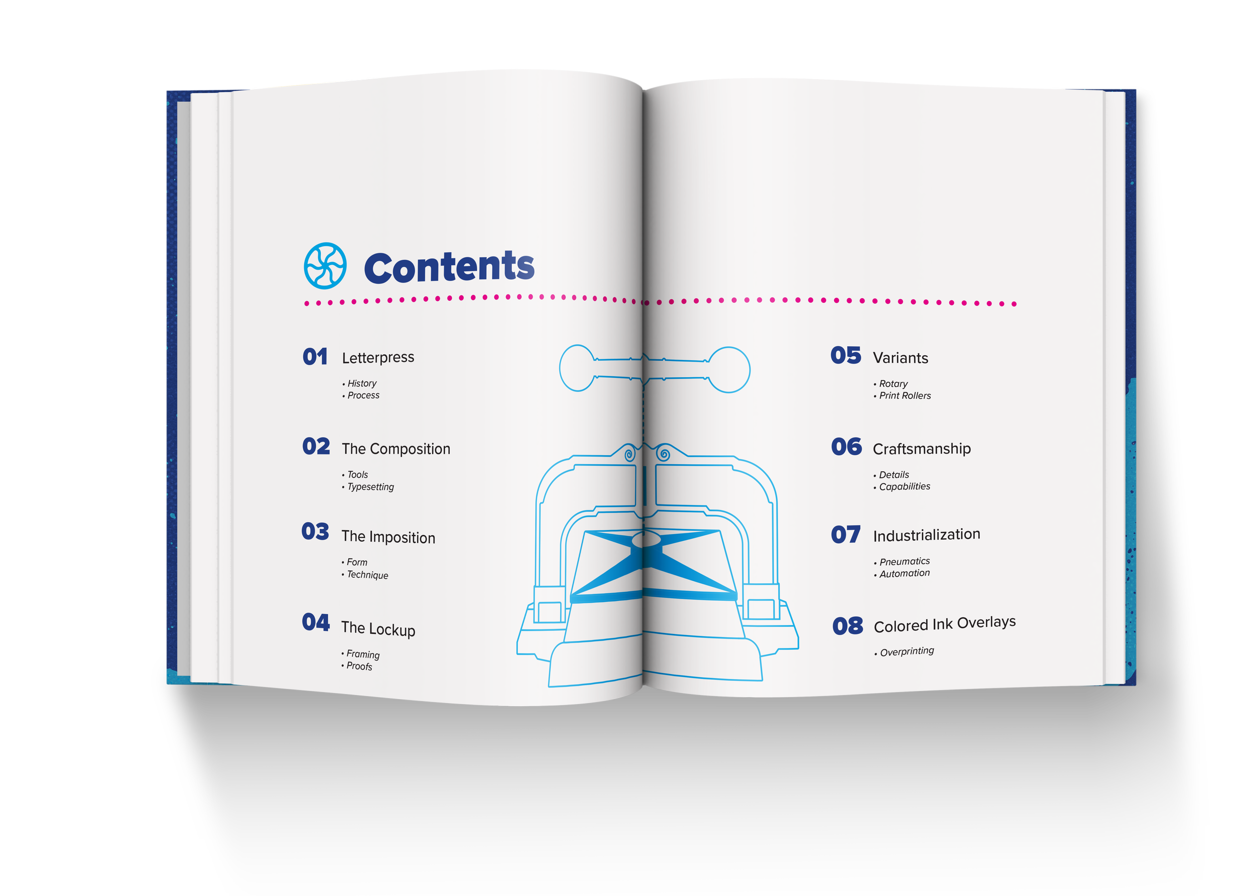
The design of the book draws directly from the spirit of letterpress: structured, hands-on, and deeply textural. The layout is built on strong grids, mirroring the mechanical precision of printing presses, while generous white space allows the content to breathe—just like type on a press bed. High-resolution macro photography highlights the texture of ink on paper, deep impressions, and movable type, while technical illustrations break down the mechanics of each press component in a clean, diagrammatic style. Spot color printing (ideally in Pantone reds, blacks, or metallics) and debossed chapter openers reinforce the tactile experience. Throughout, the book balances reverence for tradition with a contemporary design sensibility, acting as both a tribute and a toolkit for anyone curious about the enduring craft of letterpress.