Design In Music
Posi Tune Music Festival
OBJECTIVE
To visually capture the spirit of Positune—a music festival rooted in connection, rhythm, and the eclectic soul of San Francisco—by creating a visual identity that blends analog warmth with bold modern energy. The goal is to celebrate both the human touch behind the music and the vibrant, layered experience of live performance in an iconic natural setting.
DESIGN
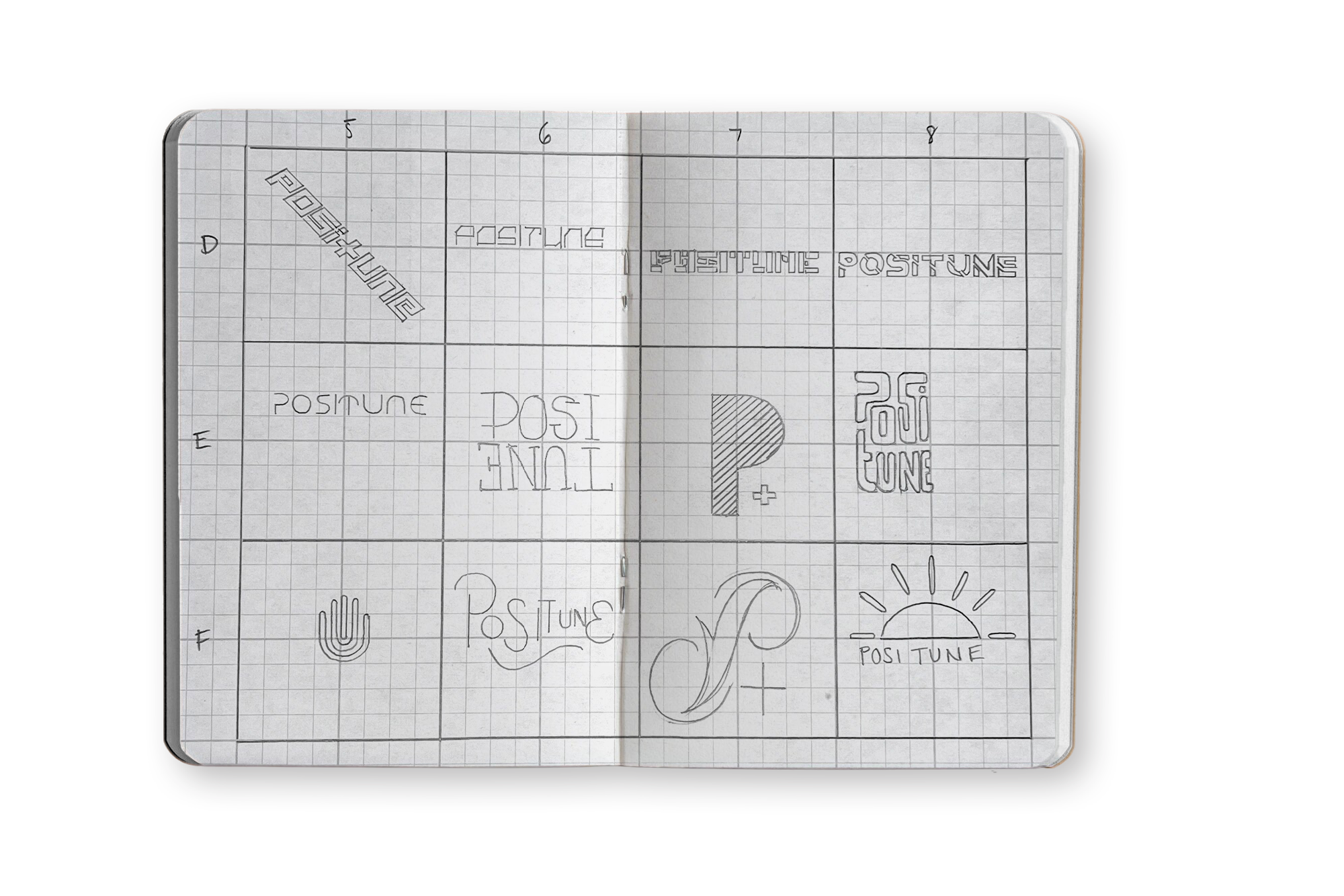
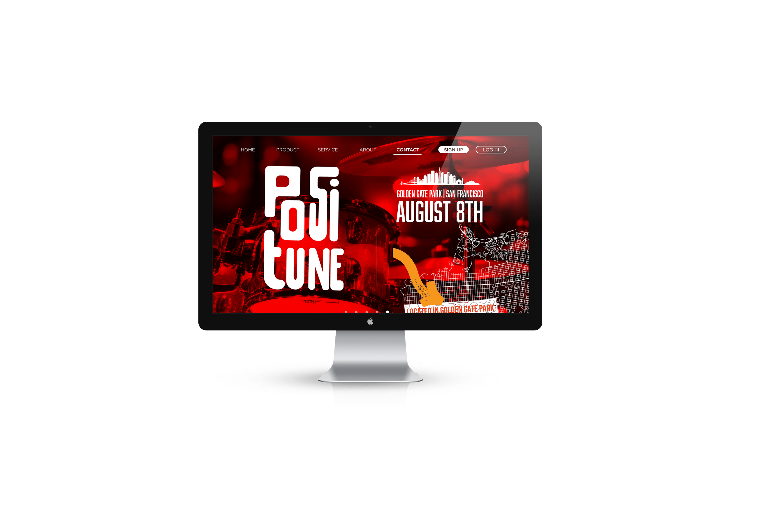
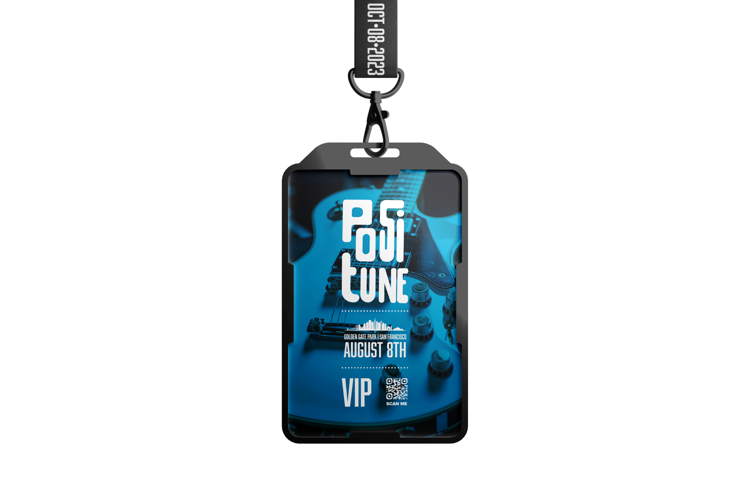
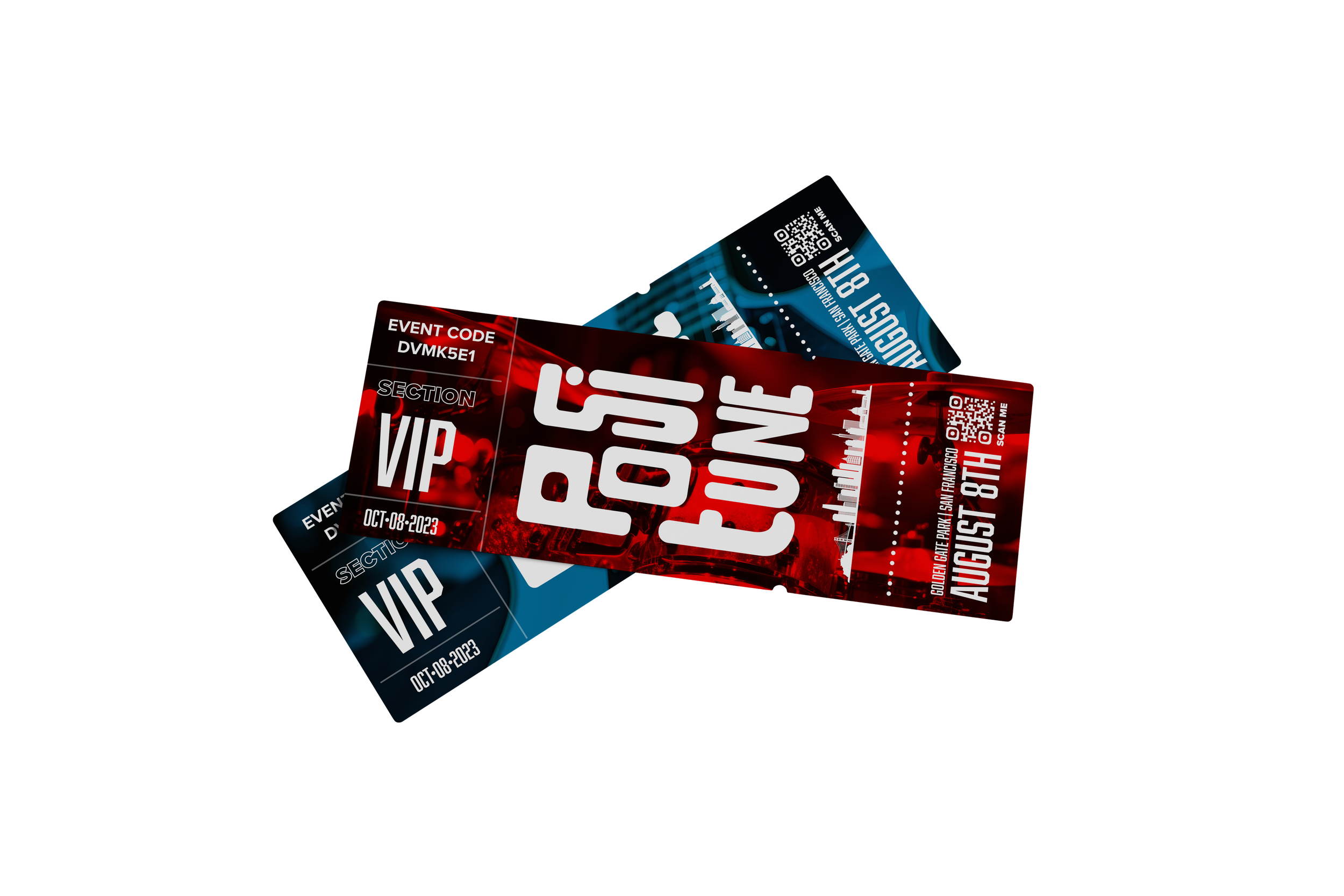
The visual system for Positune merges tactile and digital aesthetics to create a unique and immersive identity. The handmade logotype introduces a raw, personal feel—mirroring the artistry and imperfection of live music. Red and blue overlays are applied to high-contrast photography of musical instruments, evoking both 3D visual tension and emotional duality: heat and cool, passion and calm, analog and digital. These chromatic overlays create a rhythm of their own across the brand ecosystem, from posters and merch to signage and digital platforms. Typography is intentionally imperfect, reinforcing the theme of authenticity and spontaneity, while all visuals echo the layered, dynamic nature of sound in motion. The result is a bold, soulful, and unmistakably San Francisco identity.