Clarity In Fonts
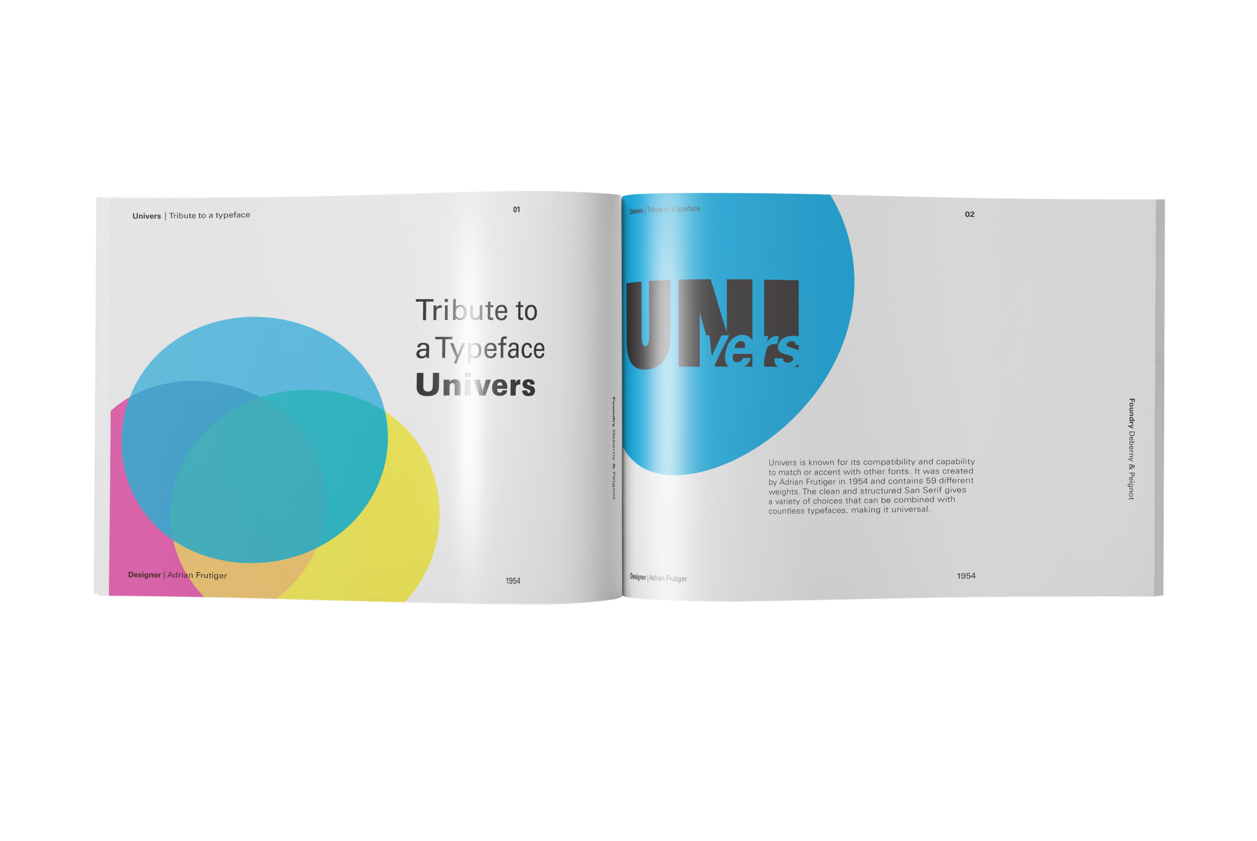
Tribute To The Typeface Univers
Objective
This project pays tribute to the iconic typeface Univers by creating a series of graphic design–focused cards that explore and celebrate its legacy, versatility, and refined geometry. The objective is to translate the rational elegance of Univers into tactile, collectible pieces that educate, inspire, and honor its role in shaping modernist visual communication. Each card functions as both a historical reference and a contemporary design object, appealing to designers, typographers, and type enthusiasts alike.
Design
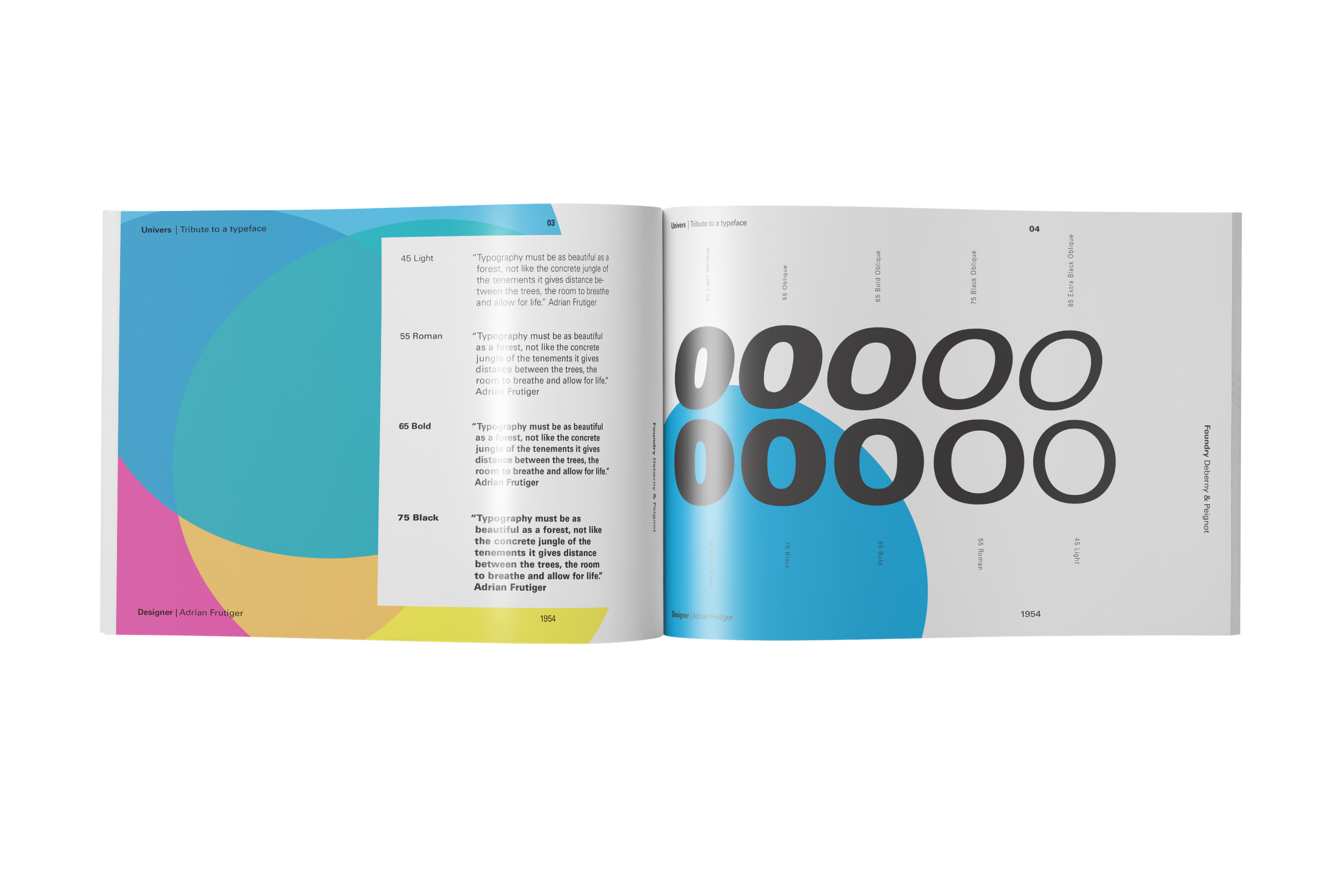
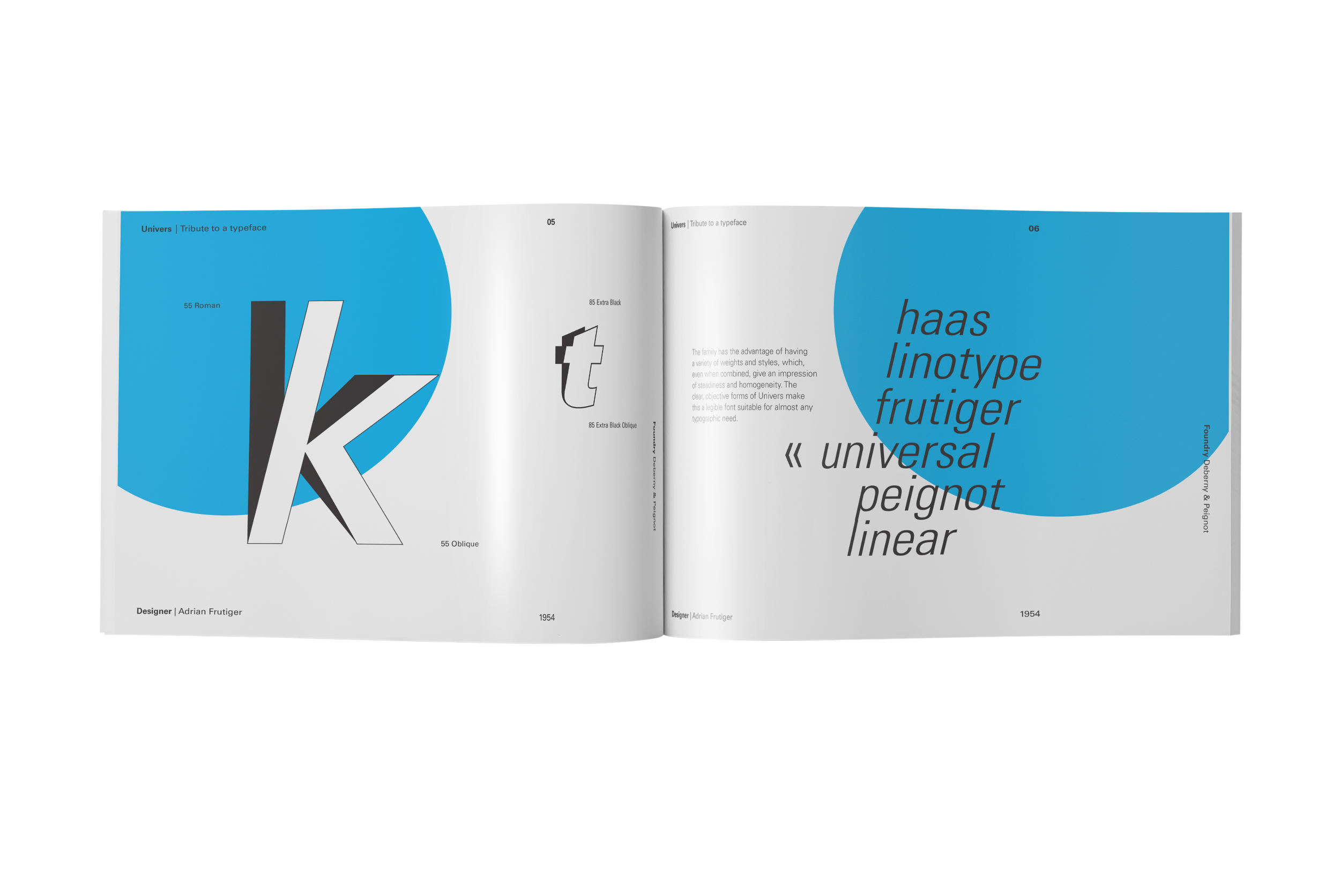
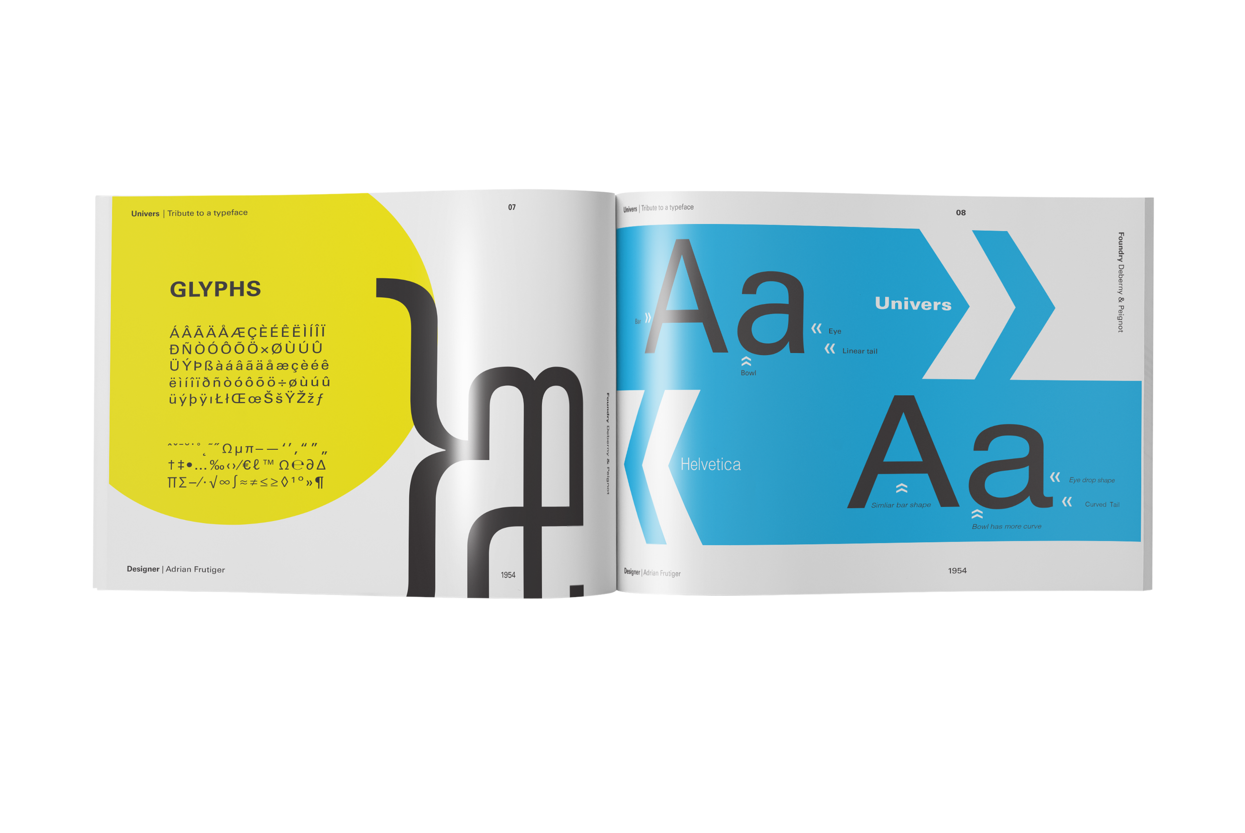
The final cards use a strict grid system and minimalist layout inspired by Swiss design principles—mirroring Univers’ own clean, modular structure. Cards vary in theme: one might showcase a single character at large scale, another a typographic quote set in Univers, and another a timeline of its release. A restrained palette of black, white, and mid-tone gray highlights the typeface without distraction, fitting for a tribute to a typeface defined by precision.